Introduction
Shadcn is a go-to library for copy-paste UI components in React projects. One commonly used component is the Tooltip, which is built on top of @radix-ui/react-tooltip .
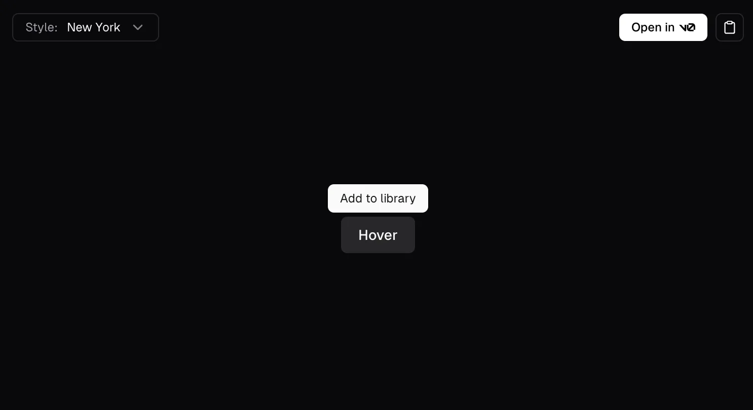
The default tooltip looks like this:

Adding Tooltip Arrows
While the provided component works well out of the box, I found myself wanting to add more customization—like adding an arrow to the tooltip. For inspiration, I turned to the Tooltip component from tremor.so, which is also based on @radix-ui/react-tooltip.

Fortunately, adding an arrow is straightforward since @radix-ui/react-tooltip includes an Arrow component. You simply need to include it inside the Content component.
import * as TooltipPrimitives from '@radix-ui/react-tooltip'

export default () => (
  <TooltipPrimitives.Provider>
    <TooltipPrimitives.Root>
      <TooltipPrimitives.Trigger />
      <TooltipPrimitives.Portal>
        <TooltipPrimitives.Content>
          <TooltipPrimitives.Arrow /> // Add the Arrow component here
        </TooltipPrimitives.Content>
      </TooltipPrimitives.Portal>
    </TooltipPrimitives.Root>
  </TooltipPrimitives.Provider>
)
However, what if you want to add a border around the entire tooltip, including the arrow?
Adding a Tooltip Border
To achieve this, you’ll need to style the Arrow component. Let’s explore some approaches:
Naive Approach
Adding a border directly to the Arrow using Tailwind classes seems like a good starting point:
<TooltipPrimitives.Arrow
  className='border border-[var(--tooltip-border-color)] fill-[var(--tooltip-color)]'
  width={12}
  height={7}
  aria-hidden='true'
/>
However, this approach doesn’t work as expected. The border property applies to the rectangular boundary of the element, not the arrow shape itself.

Using the stroke Property
Since the Arrow is an SVG element, you can use the stroke property to define a border:
<TooltipPrimitives.Arrow
  className='border-none fill-[var(--tooltip-color)]'
  stroke='var(--tooltip-border-color)'
  stroke-width='2'
  width={12}
  height={7}
  aria-hidden='true'
/>
This works better, but the arrow’s top border is still visible. To fix this, let’s explore another method.

Exploring the Drop Shadow Option
Another method is using a drop-shadow to simulate the border:
<TooltipPrimitives.Arrow
  className='-my-px border-none fill-[var(--tooltip-color)] drop-shadow-[0_1px_0_red]'
  width={12}
  height={7}
  aria-hidden='true'
/>
This creates a visually seamless tooltip with an arrow and border, but it might not always be the most precise solution depending on your use case.

It’s worth mentioning that this solution is inspired by the Tooltip component from Origin UI, which provides various customizable tooltip variants that can save development time.
How about styling it even more, like using my own custom SVG?
Custom SVG Arrow
I often visit Vercel’s website, and their dropdown navigation bar caught my eye, particularly the arrow.

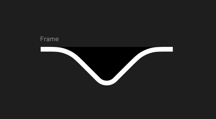
Curious about how it was designed, I opened the dev tools, inspected the elements, and found the SVG arrow. I then copied it and pasted it into Figma for a closer look.

I thought it could be an interesting design choice for a tooltip arrow.
Positioning

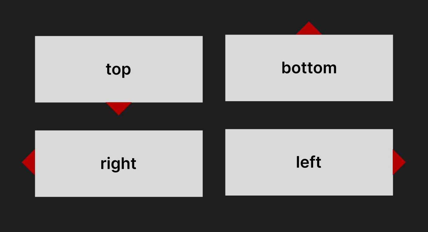
Positioning the SVG arrow depends on the tooltip’s placement—top, bottom, left, or right. The Content component exposes a data-side attribute, which you can use to adjust positioning dynamically:
[data-side='top'] svg {
  bottom: -9px;
  left: 50%;
  transform: translateX(-50%);
}

[data-side='bottom'] svg {
  top: -9px;
  left: 50%;
  transform: translateX(-50%) rotate(180deg);
}

[data-side='left'] svg {
  right: -20.25px;
  top: 50%;
  transform: translateY(-50%) rotate(-90deg);
}

[data-side='right'] svg {
  left: -20.25px;
  top: 50%;
  transform: translateY(-50%) rotate(90deg);
}
Next, we could replace the built-in tooltip Arrow component with our custom design. It should work perfectly, right?

Well, not quite yet. Take a look at this: the arrow is stuck in the center of the tooltip instead of being positioned near the trigger.

This undesired behavior happens because we only defined a static position for each side. Instead, we need to use a dynamic position to solve this issue.
Dynamic Position
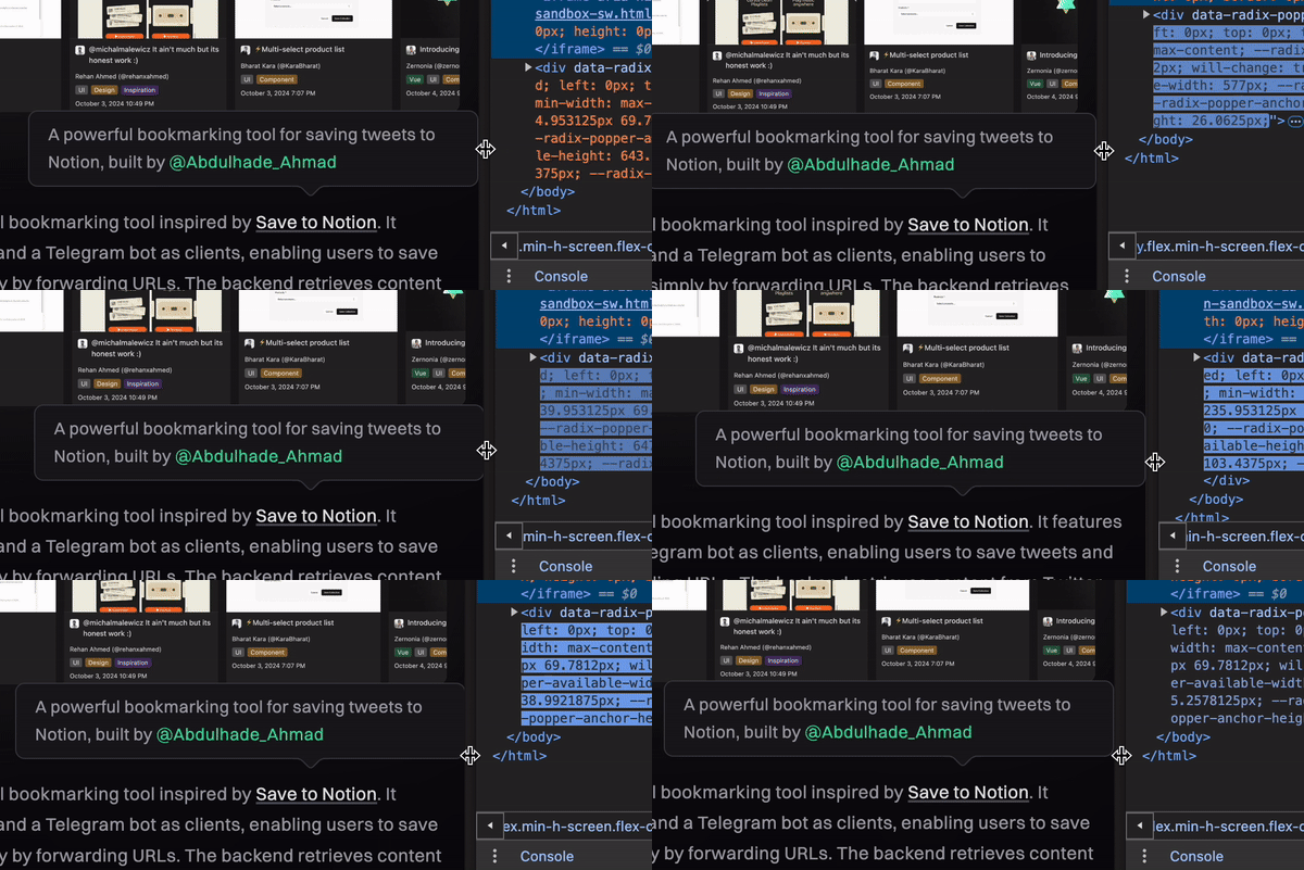
Let’s start by using the built-in Arrow component again. If you inspect the Arrow component in the dev tools while simulating the tooltip position change, you’ll notice that the SVG element is wrapped in a span with a left CSS property.

This value dynamically changes based on the tooltip’s position. We can capture this left CSS value and apply it to our custom arrow component.
To track this left value, we need to observe it using a MutationObserver.
// tooltip-arrow-primitive.tsx

import { Arrow } from '@radix-ui/react-tooltip'
import React from 'react'

const TooltipArrowPrimitive = () => {
  const arrowRef = React.useRef<SVGSVGElement>(null)

  React.useEffect(() => {
    const spanArrow = arrowRef.current?.parentElement

    const observer = new MutationObserver(() => {
      if (!spanArrow) return

      const style = window.getComputedStyle(spanArrow)

      // Get our custom tooltip component by its id
      const tooltipArrow = document.getElementById('tooltip-arrow')

      // Assign the left value as the style attribute
      tooltipArrow?.setAttribute('style', `left: ${style.left};`)
    })

    if (spanArrow) {
      observer.observe(spanArrow, {
        attributes: true, // Observe changes to attributes
        attributeFilter: ['style'] // Only look for changes to the style attribute
      })
    }

    return () => {
      observer.disconnect()
    }
  }, [])

  return <Arrow ref={arrowRef} id='primitive-arrow' className='opacity-0' />
}

export default TooltipArrowPrimitive
Then, we can call it inside the Content component.
import CustomTooltipArrow from './tooltip-arrow'
import TooltipArrowPrimitive from './tooltip-arrow-primitive'

export default ({ children, showArrow }) => (
  // Adjust each component props as needed
  <TooltipPrimitives.Provider>
    <TooltipPrimitives.Root>
      <TooltipPrimitives.Trigger />
      <TooltipPrimitives.Portal>
        <TooltipPrimitives.Content>
          {children}
          {showArrow && (
            <>
              <TooltipArrowPrimitive />
              <CustomTooltipArrow />
            </>
          )}
        </TooltipPrimitives.Content>
      </TooltipPrimitives.Portal>
    </TooltipPrimitives.Root>
  </TooltipPrimitives.Provider>
)
Final Result
It’s working as expected now 🥳🎉

P.S. You might want to adjust the top position if you prefer displaying the tooltip on the left or right side.
Conclusion
While this approach works, I’m sure there are UI libraries that allow for easier and more flexible tooltip styling. However, it feels rewarding to have found a workaround for this. If you’re interested in exploring other options, you might want to check out this discussion.
Last updated on December 16, 2024 at 9:05 AM UTC+7. See Changelog
